Paper I turned in as part of recent university course. The abstract, introduction & conclusion were all done hastily on a holiday in Thailand. The assignment was fairly open-ended (which can be dangerous and time-consuming…) and basically asked for a report on a sample set of the World Bank Climate Data, with analysis to be completed using statistical language R. I think my methodology is probably fairly unorthodox as I am still new to this space, however I did get a good grade! It’s a long read, kudos to you if you make it through to the end!
Abstract
In an era marked by rapid climatic changes, understanding the intricacies of global environmental indicators becomes paramount. This report ventures into an in-depth examination of worldwide climate data, highlighting the pivotal factors influencing our planet’s future. Utilising a vast repository of environmental data, a multi-faceted approach has been adopted in order to facilitate a comprehensive exploration of the data. Key findings include the unsurprising dominance of CO2 emissions as a principal climate change driver and the alarming vulnerabilities of regions below 5 meters of elevation due to sea-level rise. Moreover, the intricate relationships between urbanisation, agricultural lands, renewable energy, and forest areas are dissected, presenting a holistic view of our world’s ecological balance. The conclusion of this report underscores the need for real-time monitoring, emphasising the importance of areas often overlooked by mainstream reporting such as sea-level related vulnerabilities. These insights aim to inform strategies and policies, fostering adaptive measures to counter the multifaceted challenges of climate change.
Introduction
The purpose of this report is to conduct an exploratory analysis of the World Bank Climate Change Data using a number of statistical learning methods and processes, with the ultimate goal of uncovering interesting relationships within the data, understand how indicators might implicate groupings of countries, and assess how Australia compares to other countries in the world when it comes to its impact on climate change.
The process taken in this analysis is as such:
- We (reader, and I) will first conduct an initial exploration of the World Bank Climate Change Data, observing the shape, data types and NA values.
- We will then conduct and assess the efficacy of two different approaches to data imputation, simple means and KNN means.
- After data imputation is complete, we will run a principal component analysis (PCA) and using the Kaiser criterion heuristic we will significantly reduce the number of components in order to focus our analysis on only the most influential factors within the climate data.
- We will the explore various methods for determining the optimal number of clusters for K-means clustering, using the “silhouette” and “elbow” methods, gap statistics and dendograms.
- After determining the optimal number of clusters, we will then use K-means clusters to develop the clusters and then begin to explore the results first by examining plots and then by reconstructing the original data using the PCA loadings and identifying the values with the highest influence.
- Each cluster will be explored in depth first by providing an analysis of summary data for key driving factors and then examining geospatial relationships of the clusters before commenting on Australia’s global standing amongst other countries in the dataset.
- Finally, we will conduct 2 multiple linear regressions using total greenhouse gas emissions as the dependent variable – Regression 1 will be run on all variables, whereas regression 2 will exclude other CO2 related predictors – Observations will then be made about the differences.
The report will conclude with some final remarks about the key achievements of the investigation and provide some commentary about what this means for Australia in the context of its global standings.
## LOAD PACKAGES ##

library(factoextra) # factoextra: Extract and Visualize the Results of Multivariate Data Analyses
library(FactoMineR) # FactoMineR: Multivariate Exploratory Data Analysis and Data Mining
library(ggplot2) # ggplot2: Create Elegant Data Visualisations Using the Grammar of Graphics
library(sf) # sf: Simple Features for R
library(countrycode) # countrycode: Convert Country Names and Country Codes
library(missForest) # missForest: Nonparametric Missing Value Imputation using Random Forest
library(randomForest) # randomForest: Breiman and Cutler's Random Forests for Classification and Regression
library(cluster) # cluster: "Finding Groups in Data": Cluster Analysis Extended Rousseeuw et al.

## LOAD DATA ##

setwd(dirname(rstudioapi::getSourceEditorContext()$path)) # Set WD to script location
climate <- read.csv("wbcc_bc.csv") # Primary dataset (217,79)
indicators <- read.csv("wbindcc.csv") # Indicators (77,3)
sources <- read.csv("wbindccsource.csv") # Sources (77,2)
Data exploration
The shape of the original, primary dataset was “217, 80,” with 78 of 80 variables numeric and the remaining strings (iso3c, country). A summary of NA values showed that 18.65% (3,238/17,360) of cells had missing values. In order to run a principal component analysis (PCA) it would be necessary to either remove these values or ‘fill them in’ using an imputation technique. Due to the number of gaps in the data, removing rows with techniques such as ‘na.omit’ was not an option as it would omit all rows.
It is worth also noting that the dataset is comprised from data from a number of different reports, and that each value is ‘the most recent value’ as reported during a period from 2001 to 2020 – As such insights should be treated as indicative only.
## DATA EXPLORATION ##

dim(climate) # Data shape
sapply(climate, class) # Data types
colSums(is.na(climate)) # Summary of NA data
total_cells <- nrow(climate) * ncol(climate) # Total number of cells
total_na <- sum(is.na(climate)) # Total number of empty cells
na_percent <- sum(total_na / total_cells) # Empty cells divided by total
print(na_percent) # Roughly 20% cells are empty
#dataframe <- na.omit(climate) # Not an option, removes all rows
Imputation
It is necessary to address missing values prior to executing PCA, and there are several methods for doing this.
“Methods for dealing with missing data in PCA range from ad hoc to highly advanced … examples of advanced methods are missing data passive, regularized, EM-covariances, and multiple imputation … they all carry out the PCA in a statistically sound way.
Van Ginkel (2023)
Van Ginkel goes on to outline a high-level process for implementing imputation into the PCA process, and recommends performing PCA on the original data, then the imputed data only, and then finally combining the two.
I endeavoured to follow this methodology however running PCA on the original data proved problematic as I was not able to find a package that would effectively ignore missing values. The high-level process I ultimately used was:
- PCA on original data with FactoMineR package.
- Impute data with missForest package.
- PCA on imputed data.
- Compare results of both PCA’s and determine which results were better.
When performing the initial PCA, FactoMineR gave the following warning message after execution: “Missing values are imputed by the mean of the variable” – The package automatically fills in the gaps by simply averaging out available variable data; Meanwhile the missForest imputation package promised a more robust “random forest trained on the observed values of a data matrix” (CRAN, n.d.) for predicting missing values – I shifted course at this point and focused on assessing the efficacy of each of these techniques.
## PCA ON MEANS IMPUTATION ##

pca_original <- climate[sapply(climate, is.numeric)] # Prepare data, select only the numeric columns
res.pca_original <- PCA(pca_original, scale.unit = TRUE, ncp = min(dim(pca_original)) - 1) # Perform PCA on original data
#plot(res.pca_original) # Visualize PCA results

## PCA ON RANDOM FOREST  ##

pca_forest <- climate[sapply(climate, is.numeric)] # Prepare data and select only the numeric columns
pca_forest[pca_forest == 0] <- NA # Convert zeroes to NA
forest_result <- missForest(pca_forest) # Impute data with missForest
imputed_data <- forest_result$ximp # Extract imputed data
res.pca_imputed <- PCA(imputed_data, scale.unit = TRUE, ncp = min(dim(imputed_data)) - 1) # Perform PCA on imputed data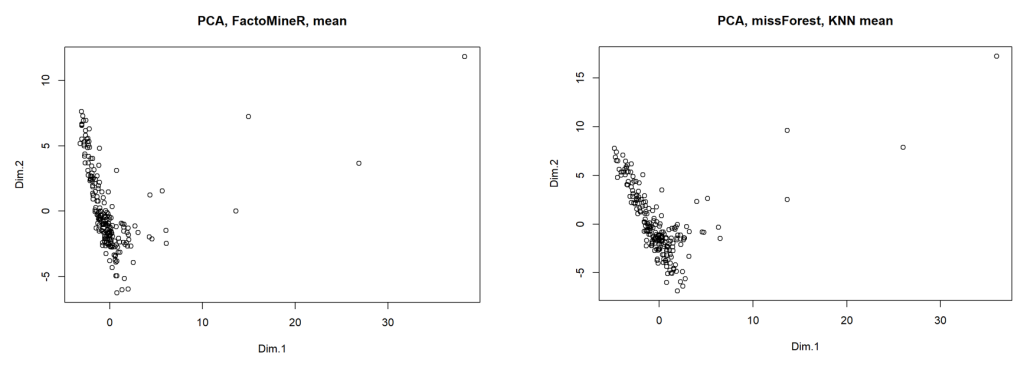
When plotting the results of the initial and subsequent PCA’s on the first 2 dimensions (refer above charts), we can see that the results are largely the same, with 2 key differences: Dimension 1 data is stretched slightly, though maintains its shape, and an outlier seen in the top-right of each chart moves further away in the formally imputed data seen in chart 2.
We can target this outlier and determine the associated country by extracting the coordinates of the datapoints in the imputed data, defining a centroid (mean of 1st and 2nd principal components) and then measuring/identifying the data point furthest away from the centre; The country identified from this process is China. The original China data had 4 NA values, table 2 (below) provides an account of these values after means and KNN means treatment.
| Disaster risk reduction progress score (EN.CLC.DRSK.XQ) | GHG net emissions/removals by LUCF | CPIA public sector management and institutions cluster average | Roads, paved (IS.ROD.PAVE.ZS) | |
| FactoMineR |
3.271 |
-17.500 |
3.033 |
30.759 |
| missForest |
3.288 |
-195.727 |
3.322 |
65.12 |
… quick shout out to word2cleanhtml.com – The above would have been a pretty awful looking screenshot otherwise…
We can see that EN.CLC.DRSK.XQ and IQ.CPA.PUBS.XQ are fairly similar, however values vary significantly between EN.CLC.GHGR.MT.CE and IS.ROD.PAVE.ZS. A (very) quick fact check confirms that the missForest data (gleaned from KNN means rather than simple means) is much more accurate than the FactoMineR data, with World Bank (2014) attributing China with a GHG net emissions/removals by LUCF (EN.CLC.GHGR.MT.CE) score of -407.5 and the Central Intelligence Agency (2023) estimating the percent of paved roads in China (IS.ROD.PAVE.ZS) at around 88%. These observations gave me the confidence to proceed with analysis of the climate data, using missForest KNN imputation to fill in the gaps.\
Selecting components
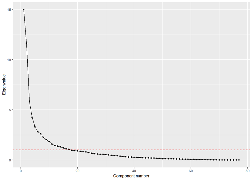
Using eigenvalues, we can identify the principal components that account for the majority of variance in our dataset. This enables us to reduce the dimensionality of our variables, allowing us to focus our analysis on the most influential factors within the climate data. One common way to determine the number of principal components to retain is by plotting the eigenvalues on a scree plot and observing where the decline (or ‘elbow’) in eigenvalues starts to level off; Another heuristic known as the Kaiser criterion, suggests we retain only n that is greater than 1, as these components account for more variance than any single original variable. The scree plot (below) starts to level out more or less at the same point as the y intercept (red line) that indicates the Kaiser criterion cut-off point. We can see that there are 17 components with eigenvalues greater than 1. Furthermore, by calculating the proportion of variance for these components (eigenvalues/sum(eigenvalues)) we can see that despite reducing our number of components by 80% they still account for roughly 80% of the proportion of variance.
## SELECTING COMPONENTS ##

eigenvalues <- res.pca_imputed$eig[, 1] # Extract eigenvalues
eigenplot <- data.frame(component = 1:length(eigenvalues), eigenvalue = eigenvalues) # Plot eigenvalues
ggplot(eigenplot, aes(x = component, y = eigenvalue)) +
  geom_line() + geom_point() + labs(x = "Component number", y = "Eigenvalue") +
  geom_hline(yintercept = 1, color = "red", linetype = "dashed")
prop_var <- eigenvalues / sum(eigenvalues) # Calculate the proportion of variance for each component
cum_prop <- cumsum(prop_var)[17] # Cumulative proportion of variance up to the 17th component
#print(cum_prop) # Print (78.7%)
#var17 <- res.pca_imputed$ind$coord[, 1:17] # Extract scores for the first 17 components
var17 <- as.data.frame(res.pca_imputed$ind$coord[, 1:17])
Determining the optimal number of clusters
There are many ways of determining the optimal number of clusters. This section focuses on the “elbow” and “silhouette” methods, gap statistic, and dendograms.
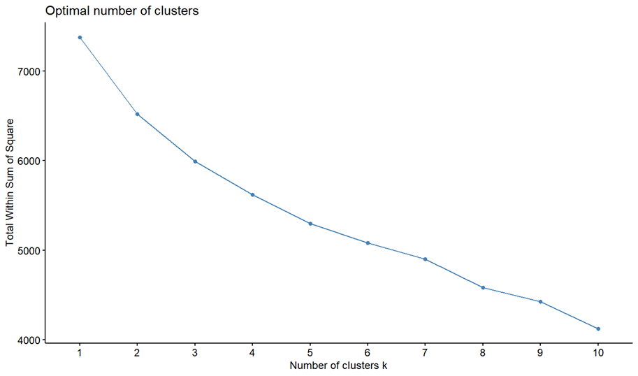
Baruah (2020) writes that the elbow method is “the most popular method for determining the optimal number of clusters (and is) is based on calculating the Within-Cluster-Sum of Squared Errors (WSS) for different number of clusters (k) and selecting the k for which change in WSS first starts to diminish.” The idea is that variation changes quickly for a small number of clusters and then begins to slow down (creating an elbow shape). The point in which the elbow starts is typically the number of clusters we can use (at least for a starting point). Chart 4 (shown on the following page) demonstrates the elbow method for the climate dataset and indicates that 3 is the ideal number of clusters.
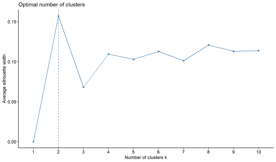
Following the result of the elbow method I produced a chart using the silhouette method (Chart 5). A silhouette chart measures how close each point in one cluster is to the points in the neighbouring clusters. Values range from -1 to 1, with a high value indicating that the point is well matched to its own cluster and poorly matched to neighbouring clusters. This chart helps determine the optimal number of clusters by looking for the highest average silhouette value. In the case of the climate data the suggested number of clusters was 2.
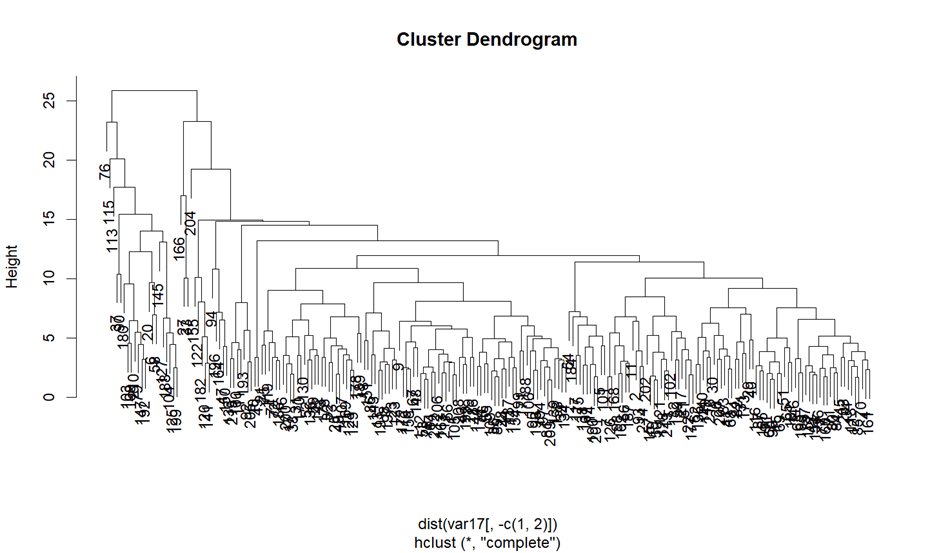
I was not satisfied with the suggestions of 2-3 clusters given that there were 217 countries in the dataset, so I looked for a third method and landed with dendograms. Dendograms are a graphical representation of hierarchical clustering and can be used to visually assess where it may be appropriate to cluster, and we can also ‘cut’ the dendogram as specified levels which will return the number of remaining clusters.
In analysing the dendrogram, it became apparent that cutting at a height of 18 provided a clear delineation of clusters while ensuring that the data wasn’t overly segmented. This cut resulted in 6 distinct clusters, which felt like an appropriate granularity given the spread of the data. The choice of 18, while partly intuitive, was also influenced by the desire to capture meaningful patterns without oversimplifying or over-complicating the inherent structures within the data.
## DETERMINE OPTIMAL NUMBER OF CLUSTERS ##

fviz_nbclust(var17[, -c(1,2)], kmeans, method = "wss") # Elbow method
fviz_nbclust(var17[, -c(1,2)], kmeans, method = "silhouette") # Silhouette method
dendogram <- hclust(dist(var17[, -c(1,2)])) # Dendogram
plot(dendogram)
dendo_clusters <- cutree(dendogram, h=18) # Define cutoff point and calculate clusters
num_clusters <- length(unique(dendo_clusters))
print(num_clusters)
Developing the clusters
James et. al. (2023, page 515) writes that “K-means clustering is a simple and elegant approach for partitioning a data set into K distinct, non-overlapping clusters.” K-means works by randomly placing K centroids and designating the nearest neighbours for each centroid, then iteratively recalculating the centroids until they have effectively stabilised.
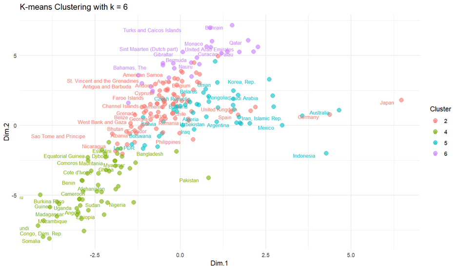
The 6 resulting clusters have between 2 and 85 countries in their respective clusters, and the results of these cluster can be seen in charts 7 and 8.
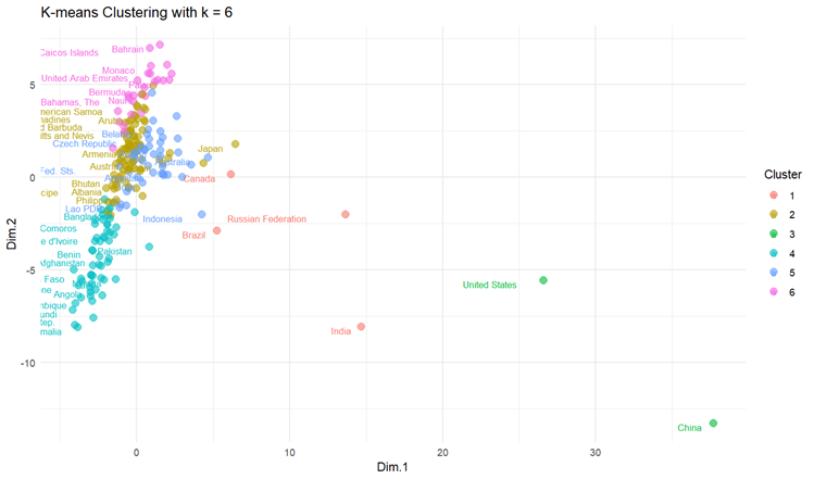
Some initial observations from the chart are that some countries, specifically the United States, China, the Russian Federation, and India, are situated further away from the dense central groupings, indicating potential outliers and/or unique characteristics that differentiate them from other countries in this dataset. The x-axis (Dim.1) seems to be a significant factor separating the United States and China from the majority of other countries, and the y-axis (Dim.2) differentiates countries vertically, with the Russian Federation and some countries in the central cluster showing variations.
## CLUSTERING ##

climate2 <- cbind(climate[, 1:2], var17) # Return iso3c and country to dimensions data
set.seed(1985) # Ensure reproducibility
km_clusters <- kmeans(climate2[, -c(1,2)], centers = 6, nstart = 50) # Create 6 kmeans clusters
climate2$cluster <- km_clusters$cluster # Add cluster assignments to data
table(km_clusters$cluster) # Examine cluster sizes

ggplot(climate2, aes(x = Dim.1, y = Dim.2, color = as.factor(cluster))) + # Plot clusters
  geom_point(alpha = 0.6, size = 3) +
  geom_text(aes(label = country), vjust = 1, hjust = 1.5, size = 3, check_overlap = TRUE) +
  labs(color = "Cluster") +
  theme_minimal() +
  ggtitle("K-means Clustering with k = 6")
Reconstructing the data
Harvey and Hanson (2022, pg. 6) write that “if we want to reconstruct the original data from the results of a PCA analysis … we must know both where the samples lie relative to the principal component axes and the location of the principal component axes relative to the original axes.” In order to further analyse the data, we can extract the original variables that have the most influence on the PCA results by first extracting the loadings variable from the PCA results. We can then use the loadings to identify and extract the original variables with the highest influence and append them back in line with our ‘iso3c’ and ‘country’ variables. The 17, ranked principal components are:
- Total greenhouse gas emissions (kt of CO2 equivalent)
- Roads, paved (% of total roads)
- Rural population living in areas where elevation is below 5 meters (% of total population)
- CO2 emissions (kg per 2010 US$ of GDP)
- Energy use (kg of oil equivalent per capita)
- Average precipitation in depth (mm per year)
- Forest area (sq. km)
- GHG net emissions/removals by LUCF (Mt of CO2 equivalent)
- Electric power consumption (kWh per capita)
- Methane emissions (% change from 1990)
- Arable land (% of land area)
- CO2 emissions from solid fuel consumption (% of total)
- Foreign direct investment, net inflows (% of GDP)
- CO2 intensity (kg per kg of oil equivalent energy use)
- Population growth (annual %)
- Nitrous oxide emissions (% change from 1990)
- Droughts, floods, extreme temperatures (% of population, average 1990-2009)
The following variables were removed as they were found to be reliant on other variables that were already present – As the variables were now essentially in an order of magnitude, I just needed to include 2 more variables at the tail end to counter this action.
- Forest area (% of land area) (AG.LND.FRST.ZS) was removed due to its relationship with Forest area (sq. km) (AG.LND.FRST.K2), and
- Electricity production from nuclear sources (% of total) (EG.ELC.NUCL.ZS) was removed due to its relationship with Electric power consumption (kWh per capita) (EG.USE.ELEC.KH.PC).
## RECONSTRUCTING THE DATA ##

loadings <- res.pca_imputed$var$coord # Get the loadings (rotation matrix) from the PCA
most_influential_vars <- apply(loadings, 2, function(column) { # For each component, find which original variable has the highest absolute loading
  return(names(column)[which.max(abs(column))])
})
c17 <- imputed_data[, c(most_influential_vars)] # Extracting the most influential columns from the imputed data
c17 <- cbind(climate[, 1:2], c17) # Add "iso3c" and "country" columns from the original dataset
c17$cluster <- climate2$cluster
head(c17) # View the first few rows of the updated dataframe
Analysing the summary data
Table 3 provides summary data (minimum, median and maximum) for all 6 clusters against the first 5 strongest components – These 5 components account for roughly 50% of the proportion of variance.
|
Indicator |
Sum. |
Clust. 1 (85 countries) |
Clust. 2 (50 countries) |
Clust. 3 (59 countries) |
Clust. 4 (4 countries) |
Clust. 5 (17 countries) |
Clust. 6 (2 countries) |
|
Total greenhouse gas emissions … |
Min |
240 |
80 |
190 |
724,930 |
30 |
6,023,620 |
|
Med |
39,930 |
35,080 |
28,890 |
1,788,020 |
19,516 |
9,189,430 | |
|
Max |
1,186,770 |
828,280 |
431,220 |
3,374,990 |
376,530 |
12,355,240 | |
|
Roads, paved … |
Min |
32.44 |
17.30 |
1.82 |
41.14 |
53.59 |
57.90 |
|
Med |
54.95 |
70.73 |
22.00 |
51.66 |
68.44 |
58.15 | |
|
Max |
98.00 |
96.50 |
76.50 |
57.55 |
78.54 |
58.40 | |
|
Rural population living … elevation below 5m |
Min |
0.06 |
0.00 |
0.02 |
0.34 |
3.09 |
0.25 |
|
Med |
1.19 |
2.26 |
1.85 |
0.44 |
16.33 |
1.30 | |
|
Max |
17.16 |
14.18 |
13.56 |
1.53 |
48.24 |
2.35 | |
|
C02 Emissions … GDP |
Min |
0.05 |
0.11 |
0.06 |
0.18 |
0.04 |
0.28 |
|
Med |
0.33 |
0.53 |
0.30 |
0.58 |
0.39 |
0.61 | |
|
Max |
1.59 |
1.60 |
1.49 |
0.92 |
1.37 |
0.95 | |
|
Energy use … |
Min |
216.81 |
565.43 |
9.56 |
636.57 |
113.95 |
2,236.73 |
|
Med |
1,538.26 |
2,585.32 |
428.39 |
3,219.21 |
2,431.78 |
4,520.36 | |
|
Max |
6,548.41 |
17,922.70 |
2,694.21 |
7,631.34 |
10,596.57 |
6,804.00 |
Observations:
- Indicators provide a cross-section of data around emissions and air quality, infrastructure, population, and energy quality.
- Total greenhouse gas emissions (kt of CO2 equivalent)
- Cluster 6, containing only 2 countries, exhibits the highest maximum and median emissions values. However, the minimum value is also significantly high. This suggests that both countries in this cluster have exceptionally high emissions.
- Cluster 1, which includes 85 countries, has a fairly low minimum and median despite a maximum of almost 1.2 million which suggests there is a country in this cluster with very high emissions.
- Roads, paved (% of total roads)
- Cluster 2, which includes 50 countries has high median and maximum values which suggest that a good proportion of the 50 countries have good infrastructure.
- Rural population living in areas where elevation is below 5 meters (% of total population):
- Cluster 5 stands out with the highest median and maximum values. This means many countries in this 17-country cluster have a significant portion of their rural population living in areas vulnerable to sea-level rise.
- CO2 emissions (kg per 2010 US$ of GDP):
- Cluster 2 has the highest CO2 emissions relative to economic output, suggesting that at least one country in this cluster has high emissions for its gross domestic product (GDP).
- Cluster 6, although it consists of only 2 countries, has a notably high median value. This implies that both countries in this cluster might have an economic model with a significant environmental impact.
- Energy use (kg of oil equivalent per capita):
- Cluster 6 is prominent with the highest minimum, median, and maximum values. This signifies an extensive energy consumption pattern for the countries in this cluster.
- Cluster 1 and Cluster 4, with 85 and 4 countries respectively, also exhibit high median values for energy use. However, Cluster 1 has a broad range, indicating variability in energy consumption across its countries.
Cluster 2, with its 50 countries, has a median energy use value of 2,585.32. The range extends from a minimum of 565.43 to a maximum of 17,922.70. This suggests that there’s a considerable spread in energy consumption across the countries in Cluster 2. The maximum value for Cluster 2 is notably high, showing that at least one country within this cluster has an exceptionally high energy consumption.
|
Indicator |
Sum. |
Clust. 1 (85 countries) |
Clust. 2 (50 countries) |
Clust. 3 (59 countries) |
Clust. 4 (4 countries) |
Clust. 5 (17 countries) |
Clust. 6 (2 countries) |
|
Total greenhouse gas emissions … |
Min |
Dominca |
Nauru |
Sao Tome and Principe |
Canada |
Tuvulu |
United States |
|
Max |
Japan |
Iran |
Pakistan |
India |
Vietnam |
China | |
|
Roads, paved … |
Min |
Guatemala |
South Africa |
Congo, Dem. Rep. |
India |
Vietnam |
United States |
|
Max |
Mauritius |
Seychelles |
Comoros |
Russian Federation |
San Marino |
China | |
|
Rural population living … elevation below 5m |
Min |
Bosnia |
Jordan |
Congo, Dem. Rep. |
Russian Federation |
Monaco |
United States |
|
Max |
Guyana |
Seychelles |
Mauritania |
India |
Maldives |
China | |
|
C02 Emissions … GDP |
Min |
Switzerland |
Malta |
Congo, Dem. Rep. |
Brazil |
Liechtenstein |
United States |
|
Max |
Kyrgyz Republic |
Turkmenistan |
Lao PDR |
Russian Federation |
Vietnam |
China | |
|
Energy use … |
Min |
Cabo Verde |
Tonga |
Lesotho |
India |
Bahrain |
China |
|
Max |
Luxembourg |
Qatar |
Gabon |
Russian Federation |
Kiribati |
United States |
The above table further elaborates on the summary data found in table 3, adding in the relative countries for minimum and maximum values. Table 5 (below) demonstrates the top 20 highest polluting countries by total greenhouse emissions. Total greenhouse emissions along accounts for around 20% of the proportion of variance for this dataset. China is responsible for around one quarter of all greenhouse gas emissions according to these results, followed by the United States at roughly 13% and India at 7%. Australia ranks in 14th place here and is responsible for just over 1.3% of total greenhouse gas emissions.
|
Rank |
Clust. |
Country |
Total greenhouse gas emissions … |
Roads, paved … |
Rural population living … elevation below 5m |
C02 emissions … GDP |
Energy use … |
|
1 |
6 |
China |
12,355,240 |
58.40 |
2.35 |
0.95 |
2,236.73 |
|
2 |
6 |
United States |
6,023,620 |
57.90 |
0.25 |
0.28 |
6,804.00 |
|
3 |
4 |
India |
3,374,990 |
41.14 |
1.53 |
0.86 |
636.57 |
|
4 |
4 |
Russian Federation |
2,543,400 |
57.55 |
0.34 |
0.92 |
4,942.88 |
|
5 |
1 |
Japan |
1,186,770 |
60.76 |
0.71 |
0.18 |
3,428.56 |
|
6 |
4 |
Brazil |
1,032,640 |
47.58 |
0.51 |
0.18 |
1,495.54 |
|
7 |
1 |
Indonesia |
969,580 |
51.05 |
3.61 |
0.51 |
883.92 |
|
8 |
2 |
Iran, Islamic Rep. |
828,280 |
70.72 |
0.52 |
1.19 |
3,060.39 |
|
9 |
1 |
Germany |
806,090 |
57.86 |
1.03 |
0.18 |
3,817.55 |
|
10 |
4 |
Canada |
724,930 |
55.74 |
0.37 |
0.30 |
7,631.34 |
|
11 |
2 |
Korea, Rep. |
718,880 |
63.97 |
1.02 |
0.43 |
5,413.35 |
|
12 |
1 |
Mexico |
679,880 |
62.80 |
0.81 |
0.36 |
1,537.26 |
|
13 |
2 |
Saudi Arabia |
638,120 |
69.03 |
0.59 |
0.73 |
6,905.84 |
|
14 |
1 |
Australia |
615,380 |
55.85 |
0.90 |
0.27 |
5,483.82 |
|
15 |
2 |
South Africa |
513,440 |
17.30 |
0.06 |
1.01 |
2,695.51 |
|
16 |
1 |
Turkey |
502,520 |
54.39 |
0.56 |
0.33 |
1,651.36 |
|
17 |
1 |
United Kingdom |
452,080 |
61.16 |
1.11 |
0.12 |
2,764.52 |
|
18 |
3 |
Pakistan |
431,220 |
32.31 |
0.42 |
0.82 |
460.24 |
|
19 |
1 |
France |
423,350 |
57.18 |
0.74 |
0.11 |
3,692.02 |
|
20 |
1 |
Thailand |
416,950 |
58.71 |
4.05 |
0.58 |
1,969.00 |
Let’s stop for smoko… Something wild happened when I asked ChatGPT to remove some garbage Word XML from the above table – It completely misunderstood me and spat out the following… It’s quite beautiful to look at.

Geospatial analysis of clusters
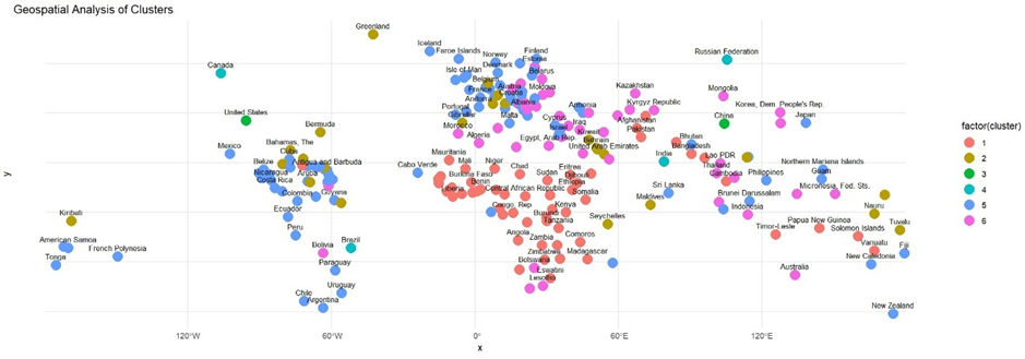
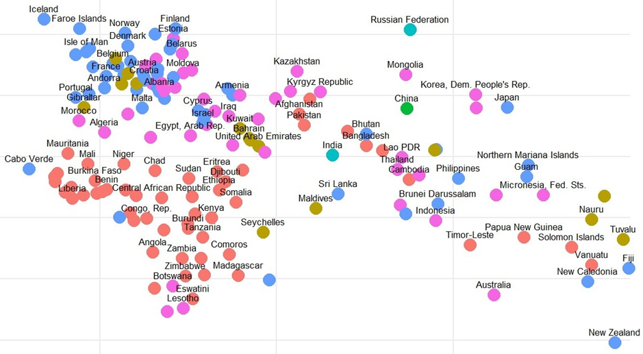
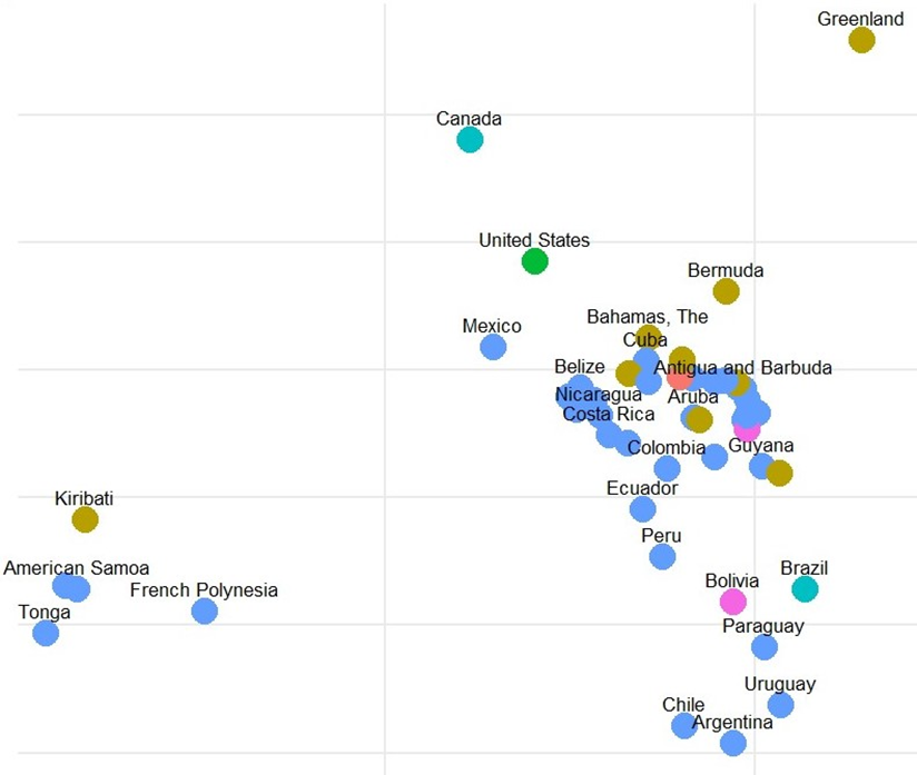
In order to further explore these clusters, we can plot the countries on a map by assigning longitude and latitude values via the iso3c codes and the ‘countrycodes’ R package, using longitude and latitude data from Google (2021).
Upon examining the Geospatial Analysis of Clusters, it is interesting (I didn’t write this in the paper I handed in, but I was f***ing delighted) to see how the model has effectively identified geographic proximities among countries. This is particularly striking considering that geography was not a known factor during the clustering phase. Such outcomes suggest that the inherent characteristics or shared attributes of countries might relate to their geographic positions.
- Cluster 1 (Red) heavily envelops the African continent as well as parts of South Asia.
- Cluster 2 (Brown) whilst fairly scattered across the globe has been applied almost exclusively to island nations.
- Cluster 3 (Green) contains the United States and China, which do not share any geographical likeness, but are the 2 largest economies in the world.
- Cluster 4 (Light Blue) contains Canada, Russia, India and Brazil – Similar to cluster 3 these countries share no obvious geographic relationship, however with the exception of Canada all have populations in the hundreds of millions.
- Cluster 5 (Blue) revolves largely around South America and Europe.
- Cluster 6 (Pink) is concerned largely with Asia and the Middle East.
Multiple linear regression
A multiple linear regression was run using “Total greenhouse gas emissions (kt of CO2 equivalent)” (EN.ATM.GHGT.KT.CE) as the dependent variable. Table 6 provides data marked as significant by R. Refer to Appendix 1 for the complete results.
|
Indicator |
Estimate |
Std. Error |
t value |
Pr(>|t|) |
Signif. Code |
|
Intercept |
170924.4722 |
49894.56298 |
3.425713385 |
0.000778168 |
*** |
|
CO2 emissions from solid fuel consumption (kt) |
1.219168834 |
0.032689534 |
37.29538697 |
4.02946E-81 |
*** |
|
CO2 emissions from gaseous fuel consumption (kt) |
1.536694648 |
0.07837757 |
19.60630637 |
1.64497E-44 |
*** |
|
Nitrous oxide emissions (thousand metric tons of CO2 equivalent) |
2.208725326 |
0.267338653 |
8.261900408 |
4.98965E-14 |
*** |
|
Urban population |
0.001247048 |
0.000199029 |
6.26564527 |
3.25692E-09 |
*** |
|
CO2 emissions from gaseous fuel consumption (% of total) |
-821.5023914 |
157.5738204 |
-5.213444652 |
5.62036E-07 |
*** |
|
CO2 emissions from liquid fuel consumption (kt) |
0.405958646 |
0.082510646 |
4.920075952 |
2.12094E-06 |
*** |
|
Electricity production from renewable sources, excluding hydroelectric (kWh) |
-7.51817E-07 |
1.77979E-07 |
-4.224197017 |
4.00191E-05 |
*** |
|
CO2 emissions (kg per 2017 PPP $ of GDP) |
-149380.3425 |
35837.59926 |
-4.168257516 |
4.99874E-05 |
*** |
|
Urban population living in areas where elevation is below 5 meters (% of total population) |
-7302.682452 |
2218.910729 |
-3.291111424 |
0.001226296 |
** |
|
Population living in areas where elevation is below 5 meters (% of total population) |
6754.339248 |
2179.827824 |
3.098565481 |
0.002295358 |
** |
|
Rural land area where elevation is below 5 meters (sq. km) |
0.673688029 |
0.223337938 |
3.016451364 |
0.002973207 |
** |
|
Rural population living in areas where elevation is below 5 meters (% of total population) |
-5109.961295 |
1854.227122 |
-2.755844327 |
0.006529392 |
** |
|
CO2 intensity (kg per kg of oil equivalent energy use) |
819.3972727 |
311.8354911 |
2.627658801 |
0.009428792 |
** |
|
Ease of doing business index (1=most business-friendly regulations) |
-148.462955 |
61.47917453 |
-2.414849519 |
0.016862183 |
* |
|
Arable land (% of land area) |
-512.3356358 |
213.2299672 |
-2.402737488 |
0.017410496 |
* |
|
Forest area (sq. km) |
0.015451972 |
0.006519121 |
2.370253842 |
0.018959695 |
* |
|
SF6 gas emissions (thousand metric tons of CO2 equivalent) |
7.772362617 |
3.294577107 |
2.359138173 |
0.019517094 |
* |
|
Prevalence of underweight, weight for age (% of children under 5) |
-884.9155852 |
410.3585847 |
-2.156444676 |
0.032533141 |
* |
|
CO2 emissions (kg per 2010 US$ of GDP) |
29756.68169 |
14022.26132 |
2.12210292 |
0.035359095 |
* |
|
CO2 emissions from solid fuel consumption (% of total) |
-317.4749354 |
155.6023143 |
-2.040297002 |
0.042954587 |
* |
|
Renewable electricity output (% of total electricity output) |
-218.4585592 |
109.6694431 |
-1.991972906 |
0.048064804 |
* |
Now that I know ChatGPT can do this… I’m just gonna straight up ask: “Can you do the weird visual thing you did before to the following table data (please)?” It’s decided to go all ‘dot-matrix Tetris’ this time… very nice.
I digress – Back to some observations:
- Many of the significant predictors relate to CO2 (to be expected). This could lead to multicollinearity. It would be worth excluding these variables and running another regression.
- Interestingly, “Electricity production from renewable sources, excluding hydroelectric” has a negative relationship. This suggests that as renewable electricity production increases, greenhouse gas emissions decrease (which is a good sign).
- Several predictors related to elevation below 5 meters are significant. This might indicate the importance of land and population distribution in relation to sea level for greenhouse gas emissions.
- The R-squared (0.9995) is extremely high. It suggests that 99.95% of the variance in the dependent variable is explained by the predictors. This might potentially be a red flag and suggest overfitting or other issues.
An additional regression was run that excluded any indicators containing ‘CO2’ in the reference text (19 in total). Table 7 provides significant results and Appendix 2 contains the complete results.
|
Indicator |
Estimate |
Std. Error |
t value |
Pr(>|t|) |
Signif. code |
|
Intercept |
1042769.935 |
413529.5324 |
2.521633532 |
0.012584523 | |
|
Urban population |
0.007842516 |
0.000485246 |
16.16195008 |
2.09E-36 |
*** |
|
Urban land area where elevation is below 5 meters (sq. km) |
132.2264983 |
21.40178311 |
6.178293539 |
4.50E-09 |
*** |
|
Disaster risk reduction progress score (1-5 scale; 5=best) |
-163242.8212 |
44041.70798 |
-3.706550647 |
0.000282597 |
*** |
|
Prevalence of underweight, weight for age (% of children under 5) |
-9082.618437 |
3444.21523 |
-2.63706471 |
0.00912413 |
** |
|
Urban population (% of total population) |
-2369.408189 |
1131.768329 |
-2.093545232 |
0.037758547 |
* |
|
Agricultural land (sq. km) |
0.114831301 |
0.057821461 |
1.985963335 |
0.048616944 |
* |
|
Roads, paved (% of total roads) |
-1648.483102 |
1971.401879 |
-0.836198403 |
0.404196778 |
* |


Back to some more observations:
- Fewer predictors are significant compared to Regression 1. It is noteworthy that only two of these are present in the first regression (“Urban population” and “Prevalence of underweight, weight for age”).
- “Prevalence of underweight, weight for age” being significant in both regressions could indicate an indirect relationship between socio-economic or health factors and greenhouse gas emissions.
- The negative relationship for “Disaster risk reduction progress score” suggests that countries making more progress in disaster risk reduction might be associated with lower greenhouse gas emissions.
- The R-squared is 0.9562, which is still very high, but not as high as in Regression 1.
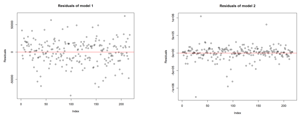
The residual plots (refer charts 12 and 13) provide some additional insights into these 2 regressions.
- The residuals for Regression 2 are more tightly packed around the zero-line compared to those of Regression 1, suggesting that Regression 2 might be a better fit for the data in terms of predicting the response variable.
- Regression 2 appears to have a more consistent spread of residuals (less heteroscedasticity) than Regression 1.
- Considering the patterns observed in the residuals and the apparent reduction in outliers, Regression 2 seems to be the better model based solely on these residual plots.
‘Conclustion‘

The primary objective of this investigation was to delve into global climate data, highlighting the pressing concerns and determining the key indicators of climatic impacts. The exploration achieved a comprehensive breakdown of multiple dimensions of climate data, presenting a clearer image of where the world stands concerning various environmental factors.
CO2 emissions undeniably dominate the list of indicators, a testament to their central role in the global climate discourse. Yet, other indicators provide equally essential insights. The emphasis on populations and land areas below 5 meters of elevation underscores the urgency of addressing the effects of rising sea levels on vulnerable populations and ecosystems. The role of renewable energy is also spotlighted, with the potential for sustainable electricity generation playing a pivotal role in mitigating climate change. Further, the indicators related to urbanisation offer a glimpse into how urban centres, the nerve centres of modern society, interact with climate phenomena. The agricultural land and forest area metrics hint at the balance (or imbalance) between nature and human needs.
It’s crucial to acknowledge the limitations of this work. As a “snapshot in time,” the data might not precisely represent the current global standings or account for rapid socio-environmental changes. Such datasets, while valuable, must be complemented by real-time data and constant updates to maintain relevance and accuracy.
In light of these insights, a recommended action is the integration of real-time monitoring tools and an emphasis on the overlooked yet critical indicators such as sea-level related vulnerabilities. Such an approach ensures that global strategies are both informed and adaptive to the dynamic nature of climate change.
Thanks for making it to the end!
Bunch ‘o references
- Baruah, I. D. (2020). Cheat sheet for implementing 7 methods for selecting the optimal number of clusters in Python. Medium.
- Braeken, J., van Assen, M. (2016). An Empirical Kaiser Criterion. ResearchGate.
- CIA. (2023). China. The world factbook.
- Datanovia. (n.d.). Extract the results for individuals/variables – PCA. Datanovia.
- Ginkel, J. (2023). Handling missing data in principal component analysis using multiple imputation. Springer.
- Google. (n.d.). countries.csv. Google for developers.
- Gudiksen, M. (2021). K-Nearest-Neighbor (KNN) explained, with examples! Medium.
- Harvey, T., Hanson, B. A. (2022). Understanding scores and loadings. The comprehensive R Archive Network. [PDF].
- James, G., Witten, D., Hastie, T., & Tibshirani, R. (2023). An introduction to statistical learning (2nd ed.) [PDF]. Springer.
- Kassambara, A. (n.d.). Agglomerative Hierachial Clustering. Datanovia.
- Kassambara, A. (2017). Principal component methods in R. STHDA.
- Morgan, L. (2020). MissForest – missing data imputation using iterated random forests. RPubs by RStudio.
Leave a Reply